WEB-designer. Learning to understand what they are talking about.
Frontend
All the user sees in his browser is the appearance of the site, its structure and interactive elements. The developers who make this part of the site are called frontenders.
It is important for a web designer to know the basic principles of frontend development in order to imagine how his shell will work. And even better - if the designer himself can design the frontend of the site.
Backend
Everything that runs on the server and does not directly relate to the appearance of the site. Usually these are databases, input commands, and the generation of templated pages. For example, when a user enters some word in a search, it is sent to the server and returned as a result of the output. The developers who do this part of the site are called backenders.
A web designer will need knowledge about the structure of servers to negotiate with programmers to implement a function. For example, to make the site store and sort e-mail addresses of users in a special way.
WYSIWYG
This is what website builders like Webflow, Tilda, and Readymag are called. They allow users to make sites from standard blocks without programming knowledge. WYSIWYG are useful for small projects where you don't need to connect databases or constantly change content.
Adaptability
The ability of the site to adapt to all device screens. This is sometimes referred to as a "mobile version" or "mobile layout. An adaptive website should look good on a huge 4K monitor as well as an old iPhone SE.
Adaptability is achieved by modularizing the layout. For example, if you have a block of three horizontal columns on a large layout, the same columns will stand vertically on the phone.
Specification
A document describing the functions of the site: how the functions should work, where the animations should be, what data you may need to implement specific features. Usually a specification is a large document with detailed text and screenshots.
The designer writes the specification to make it easier for him to discuss his solutions and technical limitations with the developers later.
Web font formats (EOT, TTF, WOFF)
An ordinary font from your computer will not work well on a website, at least because different operating systems support different formats. To solve this problem, developers have made special font formats for browsers - EOT, TTF, WOFF, WOFF2.
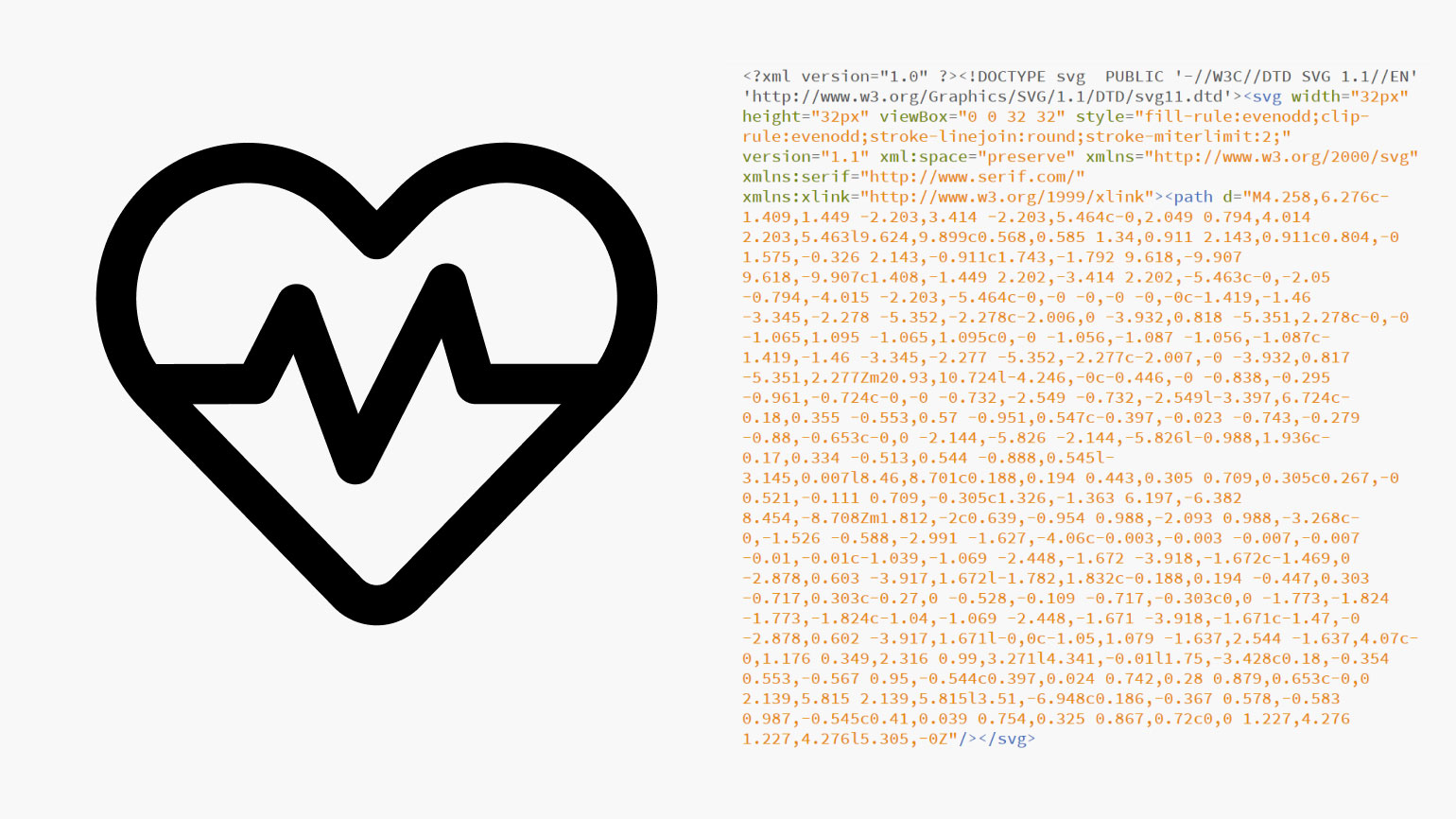
SVG (Scalable Vector Graphics)
Vector image format. Inside SVG looks like lines of code - they are converted into an image on the site. Such pictures are loaded quickly and do not lose quality when scaling the screen.
Most often, designers use SVG format for icons and logos. Photos and drawings are better stored in raster formats: JPG and PNG.
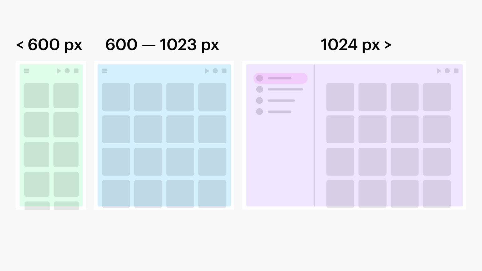
Checkpoints
Points at which the site begins to adjust to certain screen sizes. It is very common in adaptive coding, when the site should look good on all devices: on the computer monitor, on the screen of the phone and tablet.
This diagram shows exactly how the site should look at different window widths. The narrowest is 600 pixels or less. The widest is 1024 or wider.
Favicon
An icon that appears next to the site name in the browser tab, search engine, and bookmarks. Usually a favicon is a site or company logo that makes it easier for the user to remember and distinguish one link from another.
Surely you've had the experience of having many tabs open in your browser and their names disappearing. At the same time, you still roughly know which site is open - thanks to the favicon.
Header
The topmost module of the site, which usually contains auxiliary links, logo, menu, links to sections, search, and if necessary - a shopping cart with the button to log in to the account. The header should be on all pages, so the user does not get lost in the structure of your site.
Often the header is made "sticky" - when even with scrolling this block remains at the top of the page. But it is not necessary to do so, especially on small phone screens, where there is already little space.
Footer
The lowest module of the site with background information: user agreement, support phone number, links to social networks, contacts for communication. All this is placed at the bottom, users need it very rarely.
If your footer has important information, make sure the user can scroll to it at all. For example, Twitter has no footer at all, because it is designed as one endless ribbon, and you will never scroll to the end of the page.
Parallax
In web design, this is the effect when several parts of the same module move at different speeds when scrolling. This gives the impression that the parts of the composition are on different planes. In this case, the slower the object moves, the "closer" it is to the user.
Typically, parallax is used with large text blocks and a background photo: the text moves slower, and the background - at standard speed.
"Burger“
A button in the form of three horizontal bars, which, when clicked, opens the site menu. Usually "burger" is used in large online stores, where all categories can't fit into the header or the main part of the site.
Previously, the "burger" was used only in mobile versions of the site - to "hide" in his header, which does not fit into a narrow screen. Now it's often found in desktop versions as well.