Nestle
.jpg)
The logo is based on the coat of arms of the family of the company founder Henri Nestlé: his last name is consonant with nest ("nest"), so the logo also has a bird in a nest. After 1968, the brand sign looked like a modern one: not with a lonely bird guarded by a knight, but with chicks. True, at first there were three nestlings, but in 1988 the number was reduced to two.
Nokia
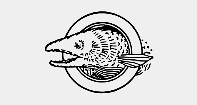
The Nokia brand already existed in the nineteenth century, although as a paper mill. It was founded in 1865 by engineer Frederik Idestam in Finland. A few decades later, the company was engaged in power generation, and then in the creation of cables and electronics. Supposedly, the logo depicts salmon from the river Nokianvirta - from which the name Nokia came. The symbol lasted a little more than 30 years, and then just the name of the brand was used as a logo.
Pepsi
.jpg)
Brad's Drink is the great-grandfather of Pepsi. That was the brand's name from 1893 to 1898, in honor of its founder, the pharmacist Caleb Bradham. Later, the company was named Pepsi. Since 1898, the brand logos have changed many times. At first they were red and were handwritten lettering - almost like Coca-Cola. In 1950, a round sign appeared in the form of a bottle cap - with red and blue elements. In a modified form, this circle survives to this day.
Mozilla Firefox
.jpg)
The Mozilla logo from 2002 - the name Firefox didn't exist then, so the phoenix was quite appropriate. In this form the brand existed for two years - and then appeared the modern name and a fiery fox, hugging the globe with its tail. Since 2004, the logo has changed a few more times, but insignificantly - now the fox is just more minimalistic.
Procter & Gamble

The company worked in the U.S. since the thirties of the 19th century: first it produced soap, then - cosmetics and household items. This logo appeared in 1845 - there is a version that barge workers marked boxes of stearic acid candles with this cross: the word "star" came from stearic acid. It was used for a little less than ten years, and in the next logos more conventional stars were drawn. First one, then a few, and at some moment, the company got a face - drawn next to the stars. In parallel, the symbol consisting of the letters P&G evolved, and at the end of the 1990s it became the main one.
Samsung
.jpg)
This was the symbol of the brand from 1937 to 1969. This is another "star" logo: the brand name translates from Korean as "stars". And the image of wheat indicates that the electronics manufacturer was originally an agricultural company that made rice flour. In the following logos, this reference was removed and only the stars were left, and then they limited themselves to a single inscription - the logo has reached our time in a very concise form.